// Boom! Look at THis!
Holy Moly spogolty!
Major props to Steph who has now given the blog a major face lift that is better then any plastic surgery a celebrity has ever had! Major props! This post is mainly for Steph, and sure, for everyone else who wants to comment on the new looks...
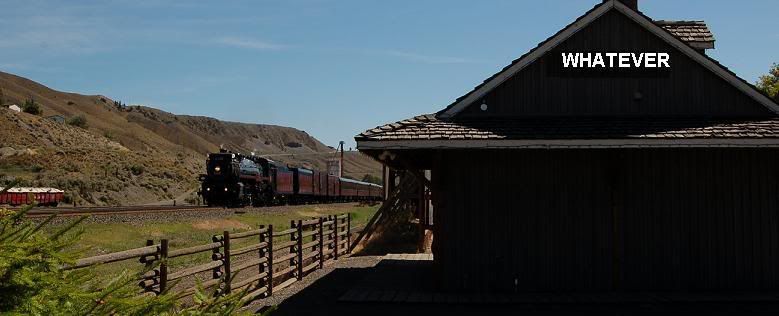
The Banner: Looks really awesome, but as I've already told you Steph, it's big. It would be awesome if we could throw some more pictures into it and keep it the same size, and have a huge major banner with a lot of pictures that remind of us whatever!
Quote Thing: I've always loved my quote thing I've had and I've noticed it disappeared! I think Stehp said that the fortune cookie was the quote, but it was just a test. But that's not where I want the quotes! I've always liked them in the middle. Maybe the quote could be part of the banner? Maybe! I don't know.
The Columns: Could we possibly make the post column a bit bigger? And the side column a bit smaller? At least over to the right to make it look tidy and cool. Or am I asking too much? Also our picture profiles are very stretched, I’m guessing that's just a temporary problem. But the fonts look so plain and dull. Could we maybe spice up the side column with cool headers for the people, the past, recent posts, links, stuff like that? Oh! And the chat box grew too! It’s fat now!
Well, there’s my two cents!


0 Comments:
Post a Comment
<< Home